
KAWI
Brand Identity
KAWI
Brand Identity
KAWI
Brand Identity
Kawi is a shampoo brand that celebrates the natural beauty of every woman. The brand is rooted in the idea that beauty shines brightest when it is nurtured, not altered. Kawi’s products are crafted to be 100% vegan, natural, and cruelty-free.
Kawi is a shampoo brand that celebrates the natural beauty of every woman. The brand is rooted in the idea that beauty shines brightest when it is nurtured, not altered. Kawi’s products are crafted to be 100% vegan, natural, and cruelty-free.
Project Overview:
For KAWI Shampoo & Conditioner, I created a complete brand identity system from the ground up. The scope included logo design, typography, color palette, iconography, brand imagery, label design for product packaging, and illustrative elements. Each component was designed to reflect KAWI’s values of simplicity, natural beauty, and accessibility.
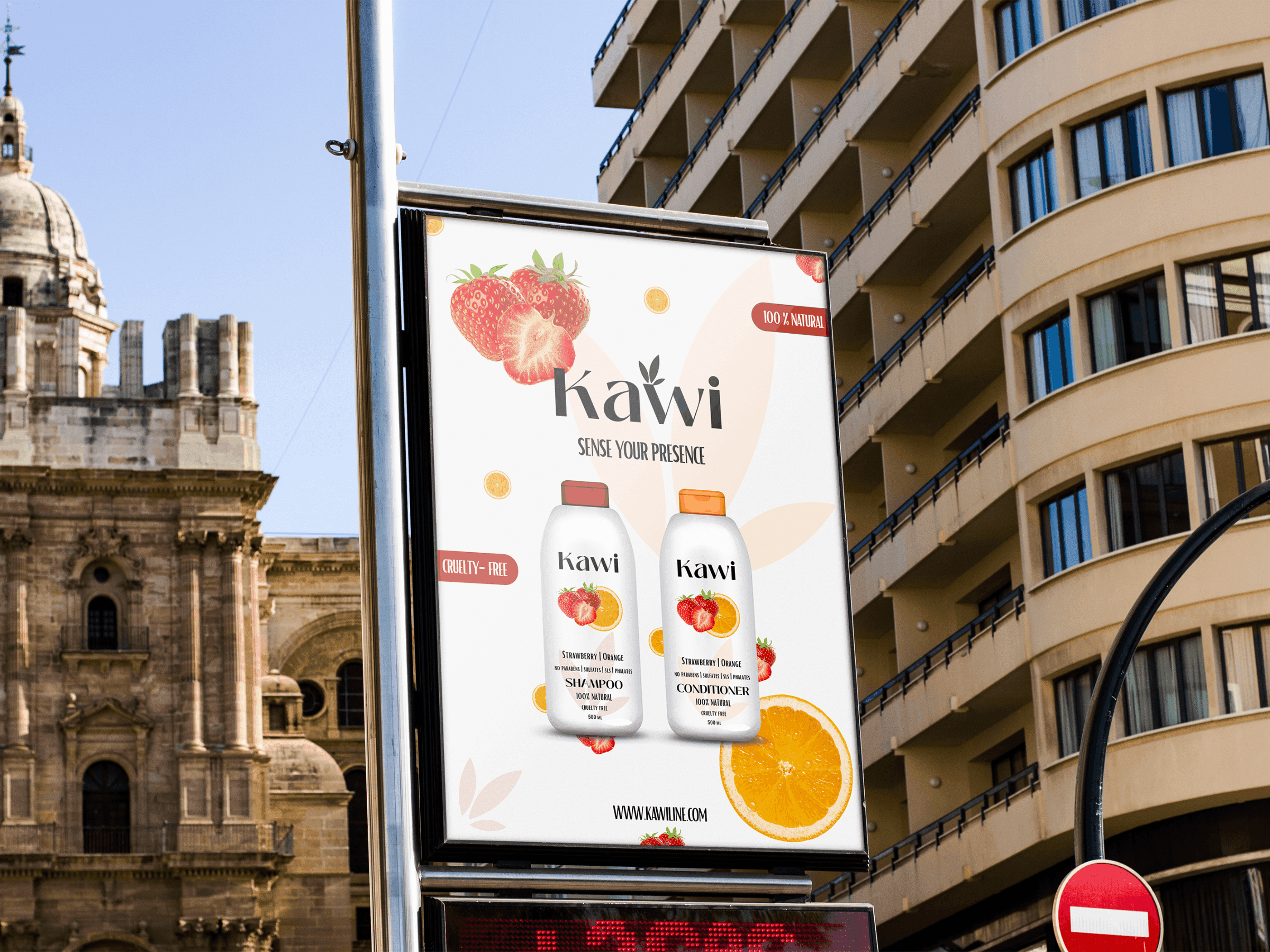
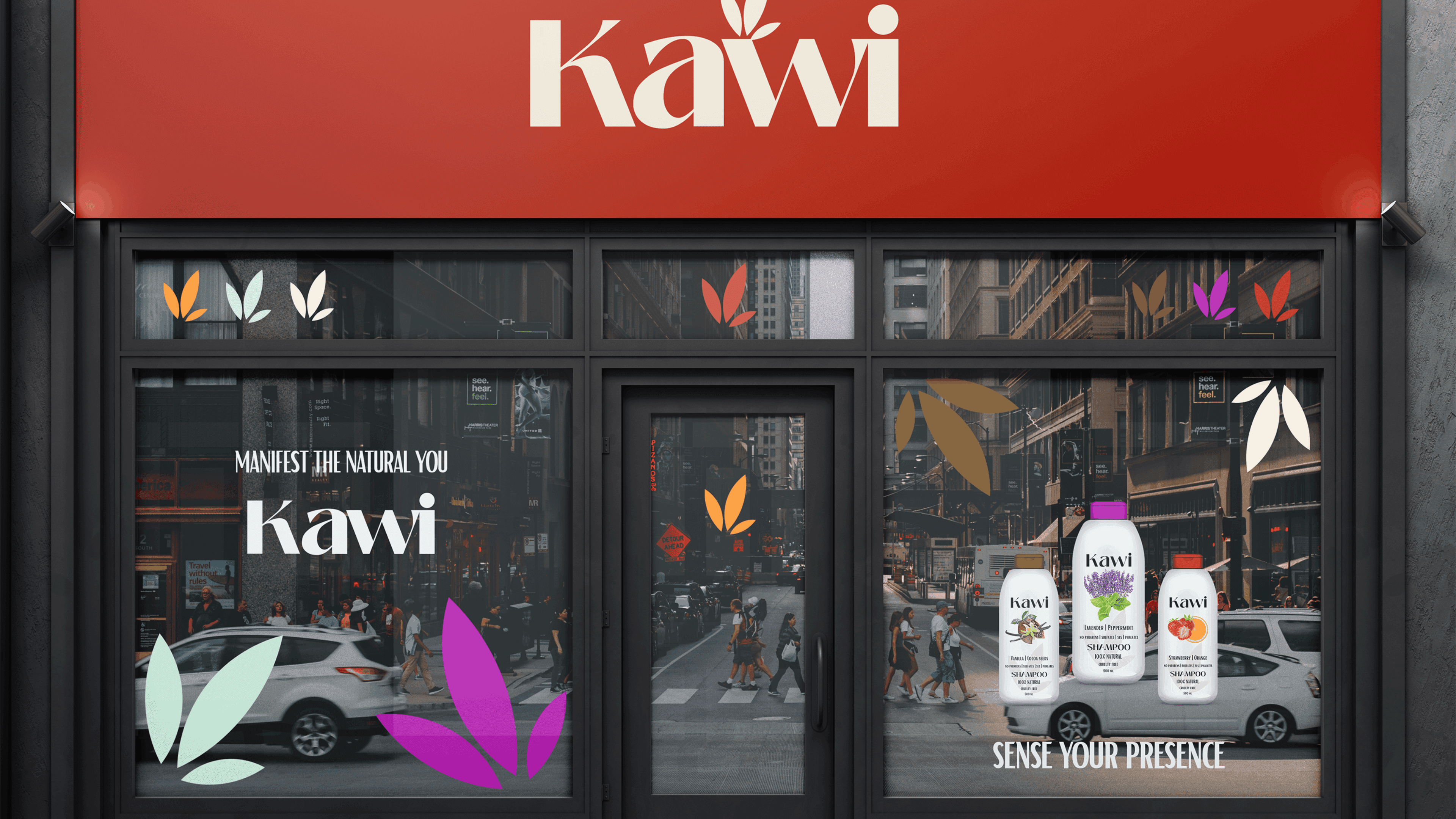
To ensure consistency and real-world applicability, I extended the brand across multiple touchpoints. This included visual applications on shampoo bottles and labels, as well as branded materials such as shopping bags, mugs, business cards, envelopes, and large-scale billboard mockups. These applications demonstrated how the identity performs across both physical and marketing contexts, resulting in a cohesive, versatile brand system ready for launch.
Project Overview:
For KAWI Shampoo & Conditioner, I created a complete brand identity system from the ground up. The scope included logo design, typography, color palette, iconography, brand imagery, label design for product packaging, and illustrative elements. Each component was designed to reflect KAWI’s values of simplicity, natural beauty, and accessibility.
To ensure consistency and real-world applicability, I extended the brand across multiple touchpoints. This included visual applications on shampoo bottles and labels, as well as branded materials such as shopping bags, mugs, business cards, envelopes, and large-scale billboard mockups. These applications demonstrated how the identity performs across both physical and marketing contexts, resulting in a cohesive, versatile brand system ready for launch.

Color Strategy & Product Differentiation
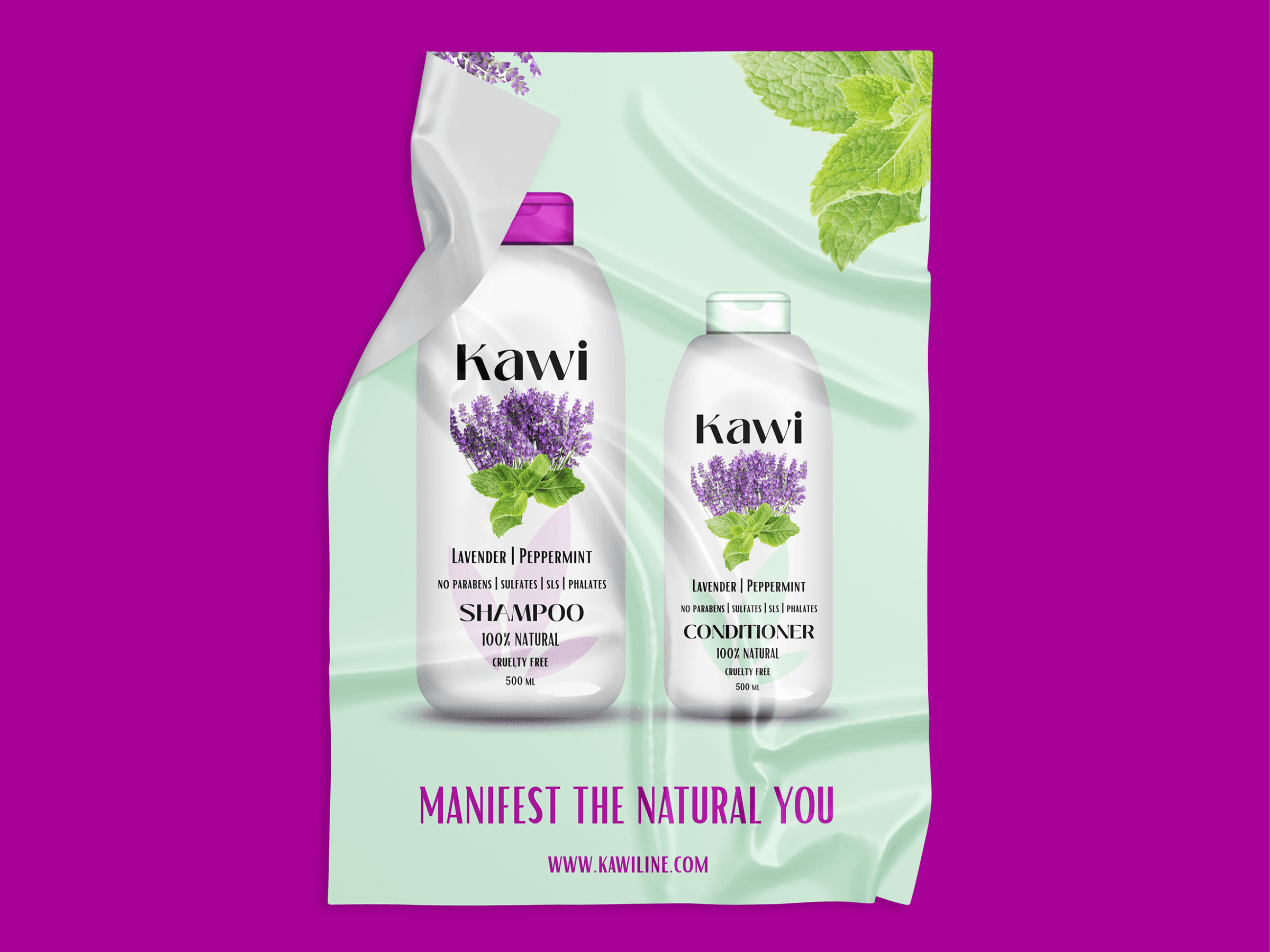
The KAWI color palette was inspired by the brand’s three shampoo and conditioner scent combinations: vanilla & cocoa seeds, lavender & peppermint, and strawberries & oranges. Each scent influenced its own color direction, helping create a clear visual distinction between products while maintaining a cohesive brand system.
To improve usability, shampoo and conditioner bottles were differentiated by cup color, allowing users to quickly identify each product. The palette was grounded in real, natural references - cocoa seeds, strawberries, and oranges - ensuring the colors felt authentic rather than artificial. Supporting inspirational imagery was carefully selected to evoke a sense of freshness, natural connection, and sensory experience.
Color Strategy & Product Differentiation
The KAWI color palette was inspired by the brand’s three shampoo and conditioner scent combinations: vanilla & cocoa seeds, lavender & peppermint, and strawberries & oranges. Each scent influenced its own color direction, helping create a clear visual distinction between products while maintaining a cohesive brand system.
To improve usability, shampoo and conditioner bottles were differentiated by cup color, allowing users to quickly identify each product. The palette was grounded in real, natural references - cocoa seeds, strawberries, and oranges - ensuring the colors felt authentic rather than artificial. Supporting inspirational imagery was carefully selected to evoke a sense of freshness, natural connection, and sensory experience.
Target Audience & Brand Positioning
KAWI was designed for medium-income women who seek natural, effective hair care without the expectations or price point of luxury brands. The brand highlights its vegan values by focusing on fruits and plant-based ingredients, appealing directly to customers drawn to vegan and cruelty-free products. Bold, expressive colors - such as red, orange, vibrant pink, and deep brown - are paired with softer accents like light beige and subtle green to create a balanced yet impactful palette.
Product labels feature rich, high-quality photography of real fruits and plants - strawberries, oranges, cocoa seeds, and peppermint - presented without backgrounds to keep the visuals clean and striking. This strong, sensory imagery is designed to visually stimulate appetite and freshness, while minimal bottle design and typography maintain clarity and simplicity. The result is an identity that feels vibrant and rich, yet accessible and honest - avoiding both luxury excess and clinical aesthetics.
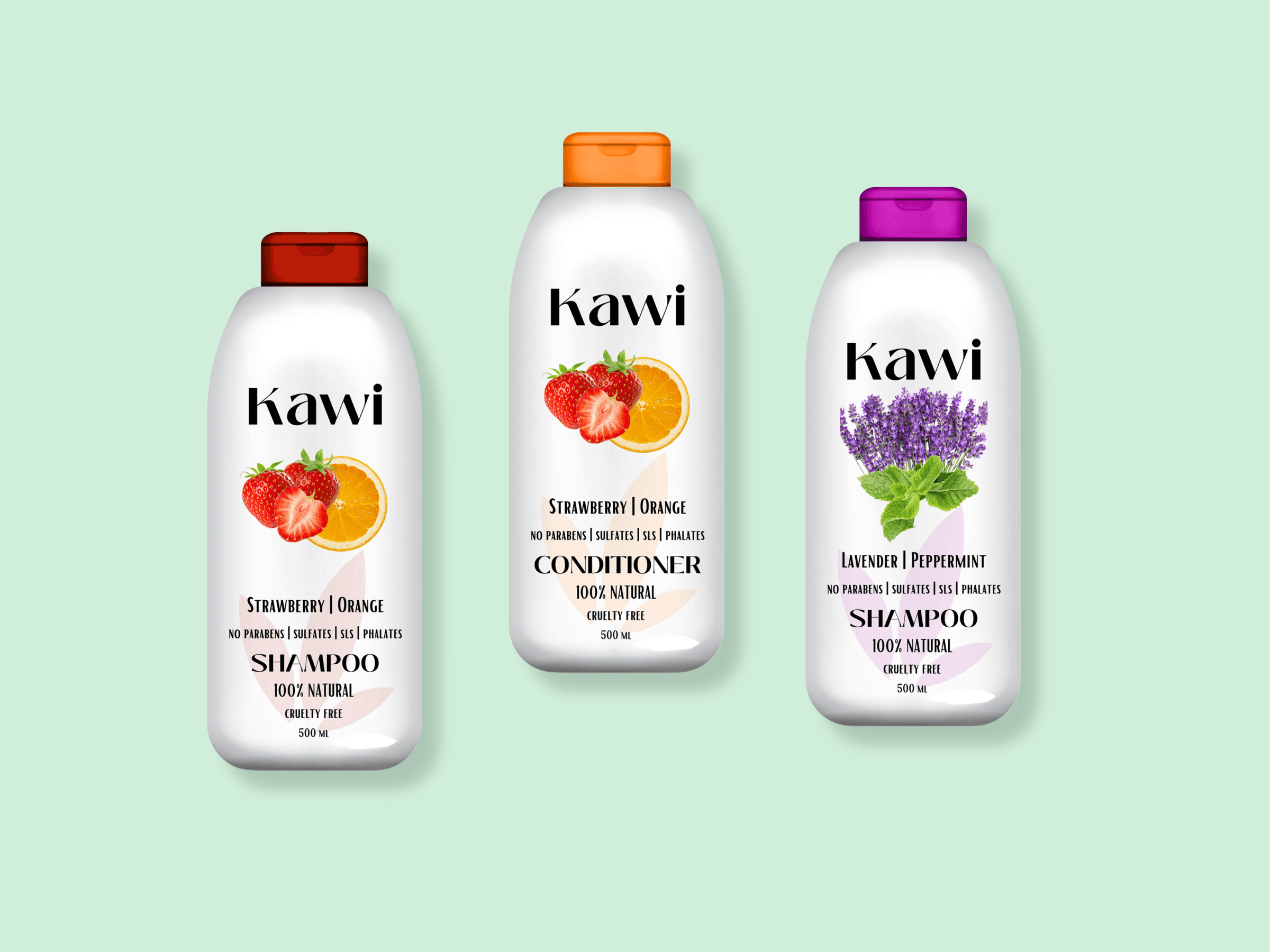
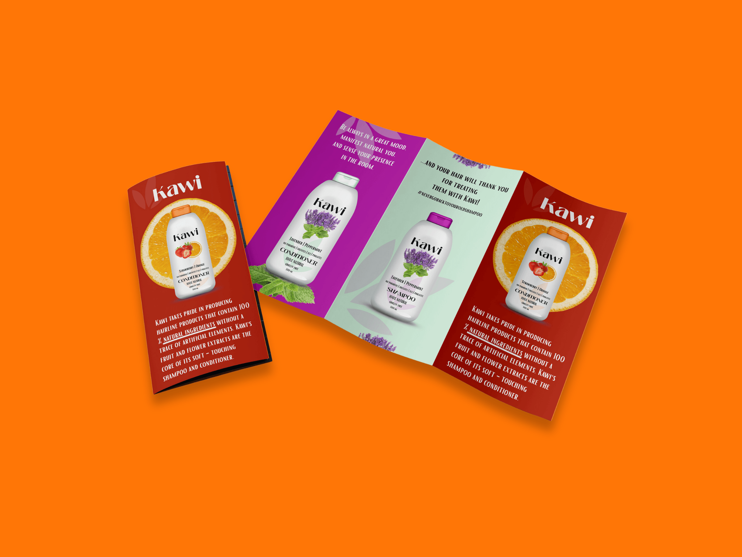
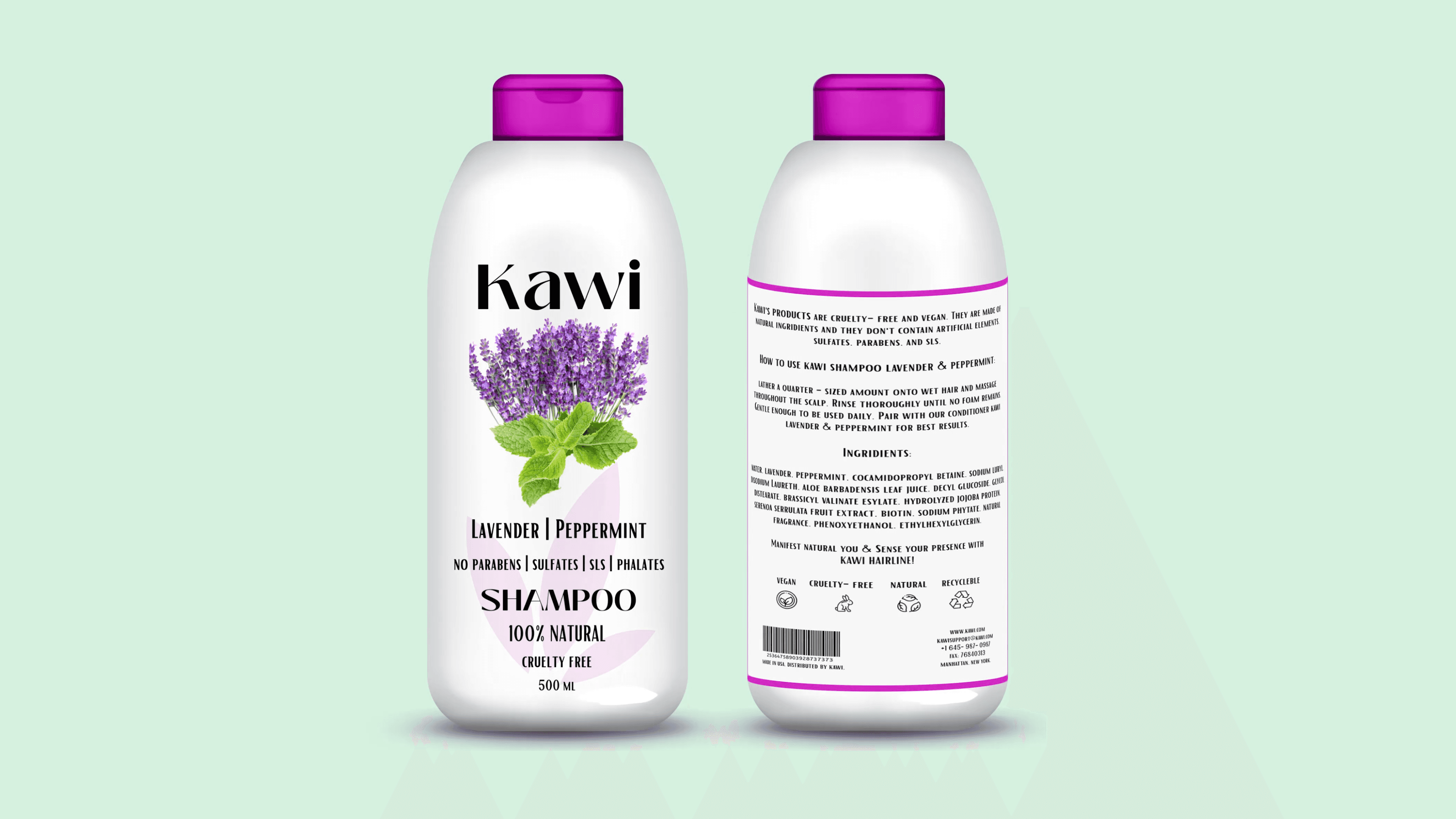
Packaging Design & Shelf Presence
Packaging was designed with clarity and quick recognition in mind. Label layouts are intentionally minimal, especially on the front, which presents only essential information - product name, scent, volume (ml), and clear emphasis on being vegan and natural. This restrained approach keeps the front label simple, allowing the strong, rich ingredient imagery to capture attention while the text reinforces what customers are looking for: honesty, transparency, and natural ingredients.
The back label provides more detailed information while maintaining simplicity and a clear hierarchy. Icons and visual cues highlight the most important attributes, such as vegan, cruelty-free, and natural ingredients, making the information easy to scan and understand. Shampoo and conditioner are differentiated through color variations, supporting intuitive selection while preserving a cohesive visual system across the product line.
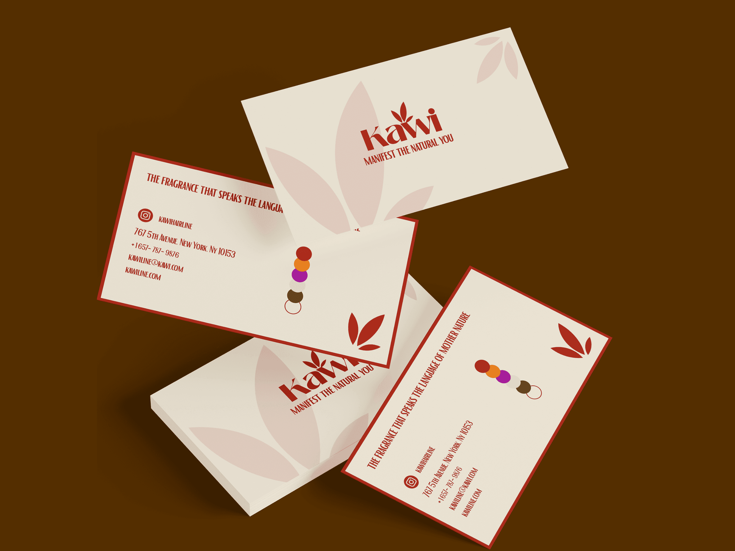
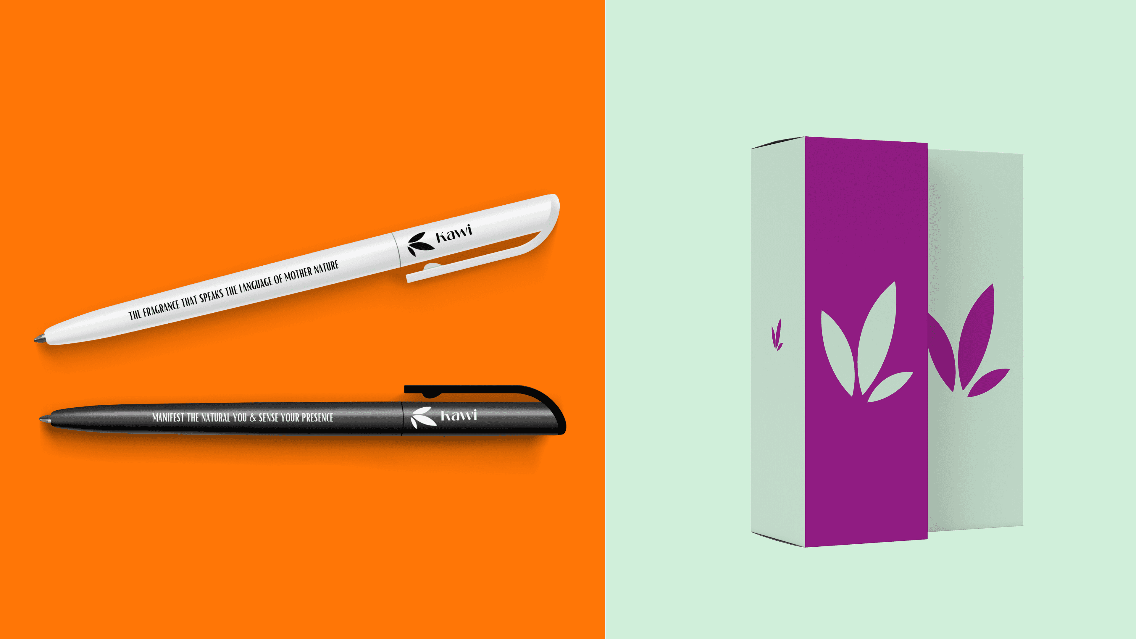
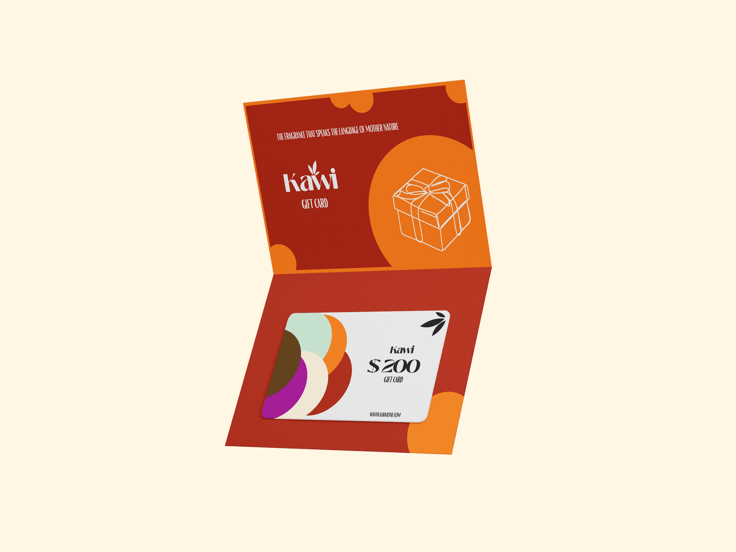
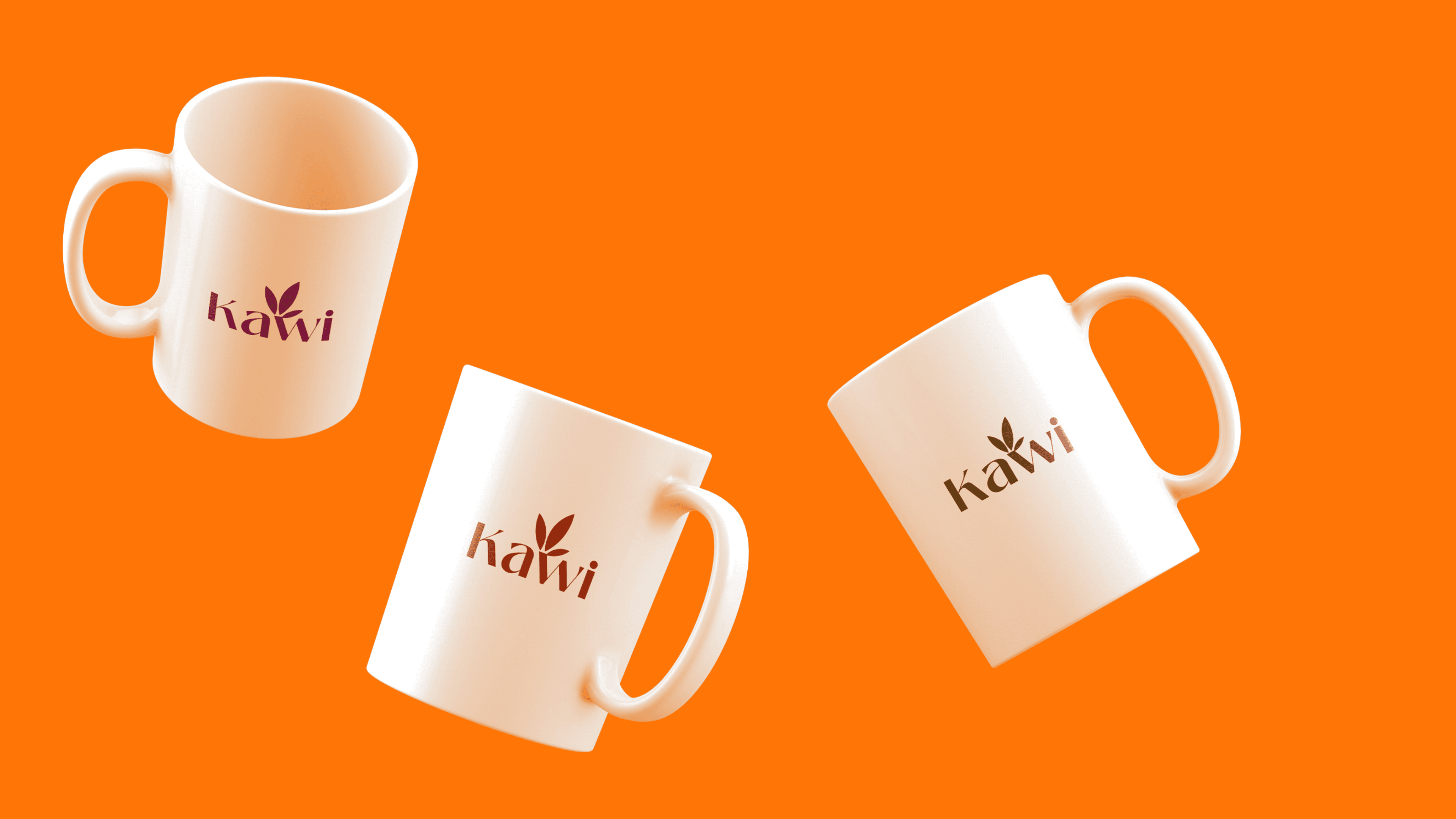
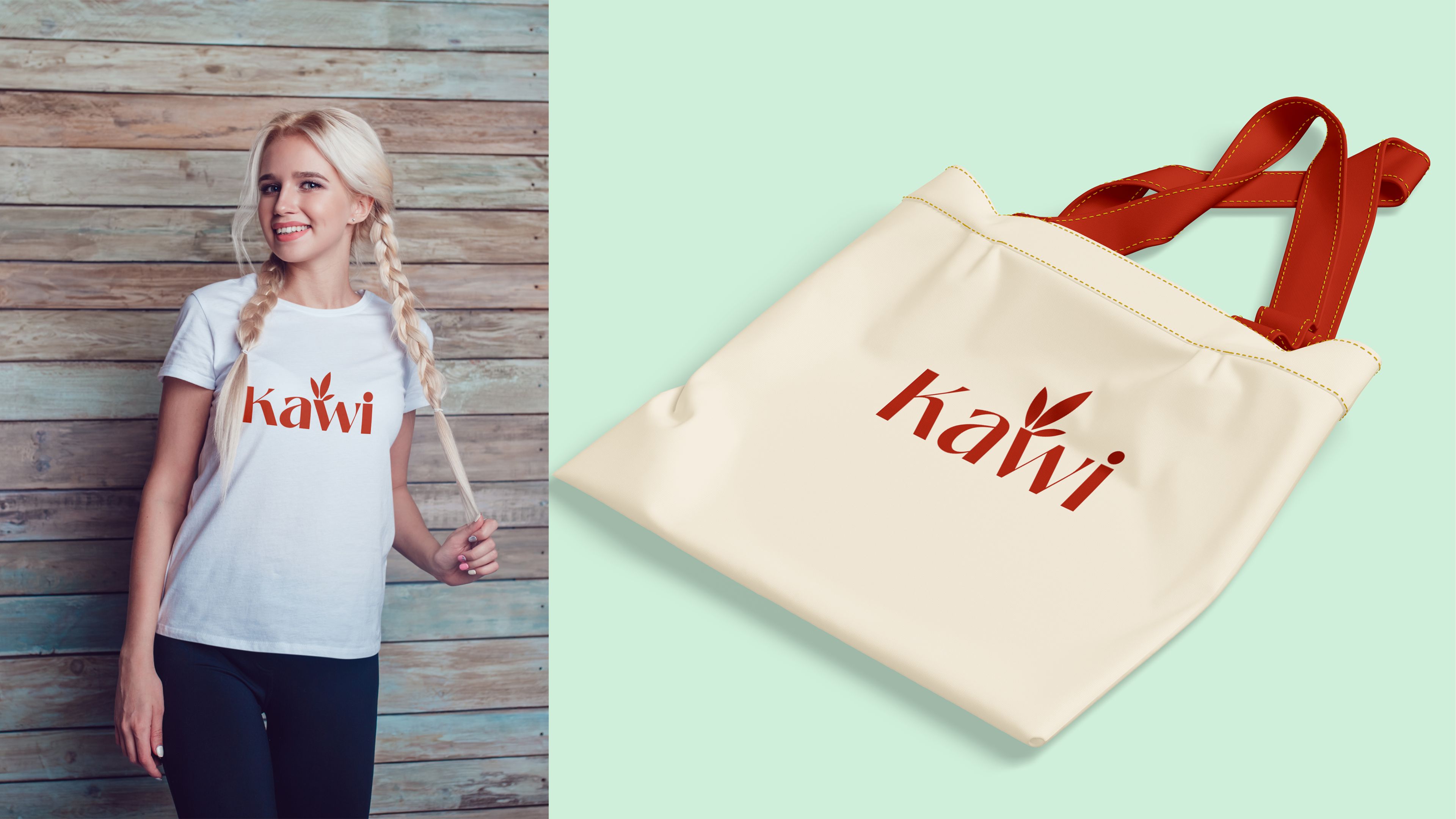
Brand System & Applications
The KAWI brand identity was built as a flexible system that translates consistently across multiple touchpoints. Beyond product packaging, the identity was applied to branded materials such as shopping bags, mugs, business cards, envelopes, and billboard concepts. These applications demonstrate how the system scales while maintaining visual coherence. The modular structure of the identity allows for easy expansion into future scents, product lines, and marketing assets without compromising brand recognition.

get in touch
Open to full-time roles as well as contract-based opportunities.
Contact Me
get in touch
Open to full-time roles as well as contract-based opportunities.
Contact Me
get in touch
Open to full-time roles as well as contract-based opportunities.